What's Hot
The What’s Hot module provides predefined analyses, which give you quick and easily available insights into your customers' search patterns.
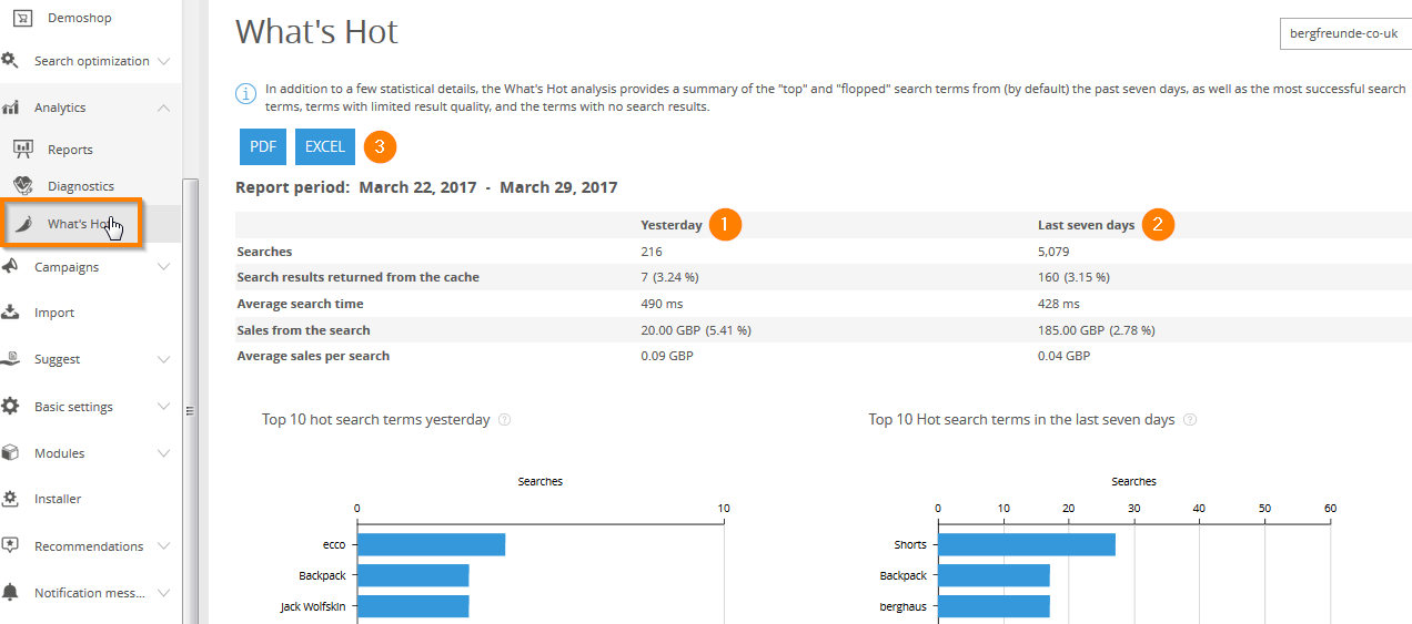
The overview shows data from yesterday (1) and the last seven days (2).
Apart from the web-version, the report can also be viewed in PDF or Excel formats(3). You can configure the program to mail them to you at fixed intervals (see Notification Messages).
To enlarge a diagram, click it.
Statistics
The first section of the report is concerned with search statistics. Alongside the number of initial search queries (1), it also shows how many of these were answered directly from the cache (in absolute and percentage terms) (2) and how long the average search query took (3).
The Sales Tracking information (4) allows generation of commercial data such as general value per search and average sale value per search term. The percentage shown following the value of sales is taken from the search function. It shows shows the percentage of total revenue this term contributed.
Hot and Flop – Search Terms
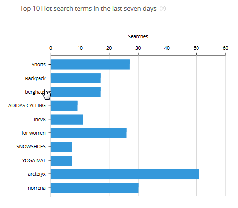
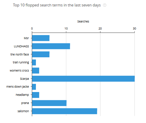
The Hot and Flop data provides a trend analysis. It highlights search terms that indicate a positive (hot) or negative (flop) variance from the expected search volume. The sequence of data is in descending order by amount of variance.
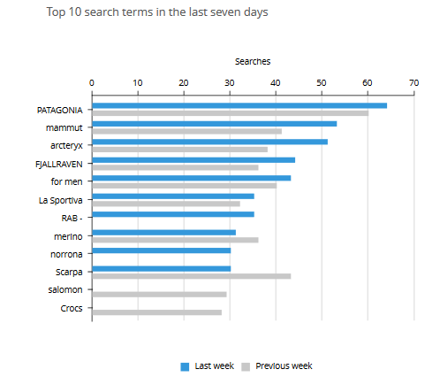
Top 10 Search Terms
This list shows the most frequently used search terms in your shop. The data is sorted in descending order, by frequency.
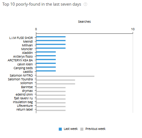
Top 10 poorly found
This list contains the search terms that are frequently sought but that return a similarity level below 100%. In such cases it can be assumed that it should be possible to optimise the results. The data is sorted in descending order, by frequency.
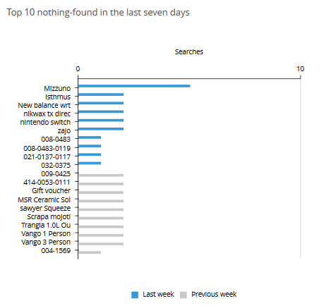
Top 10 nothing found
This list contains the search terms for which FACT-Finder was unable to find matching articles. The data is sorted in descending order, by frequency.
Click Through Ratio
This chart shows the average percentage of clicks on a presented product after the search results are displayed.
The Click Tracking data must be integrated in order to calculate the Click Through Rate.
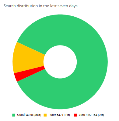
Search Distribution
The pie chart provides an overview (in absolute and percentage terms) of the distribution of search queries according to result quality (good = green, poorly found = yellow, nothing-found = red).
