FACT-Finder Search Integration Best Practice
The purpose of this section is to provide suggestions and ideas on how to integrate FACT-Finder. The items below should be viewed as hints and are intended to explain the possibilities for your implementation. Depending on your shop and sector, it may be that some of the items below are not suitable or can be ignored.
Examples for FACT-Finder Search
Design
Place the search box either to the left or in the middle of the header
The search box should attract the visitor’s eye immediately, so it is recommended that this is located in the left-hand region or in the middle of the header region.
Use icons in search results
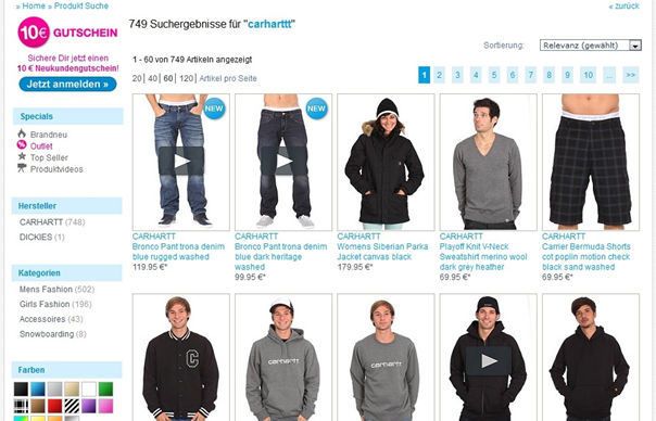
If you want to refer to product characteristics on a target basis (features such as “new”, “bargain”, “video”, etc.) then you can use relevant icons in the search results. Remember, though, to keep the amount of information to a reasonable level, since it is very easy to overload the results page and annoy customers with a crowded, difficult to read list.
Offer multiple display options for search results
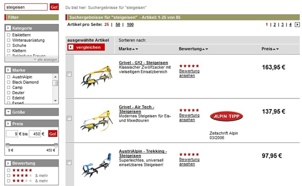
In some cases it may be advantageous to offer the customer multiple view options, allowing them to switch between a list view and a gallery view.
Usability
Prominently dsiplay the search box
Usability studies have demonstrated that a very large proportion of shop visitors enter the shop directly through the search function. Therefore, we recommend that you make the search box relatively large and prominent on your page, so that it immediately attracts the eye. In addition, the focus should be placed directly onto the search box so that users can enter their search term straight away.
Adjust results display to your product profile
The way results are displayed may also differ according to the type of products on offer. For example, if your shop sells items of fashion, a gallery view will be most suitable to allow you to emphasise the design. On the other hand, retailers of products to customers who are more interested in specifications will benefit to a greater extent from a list view.
Highlight additional information for products
If your visitors are able to access specific additional information (such as 360° views, product videos, etc.) from the details page of a product, you should alert them to this on the results page, possibly even giving them the option to view these extras from there.
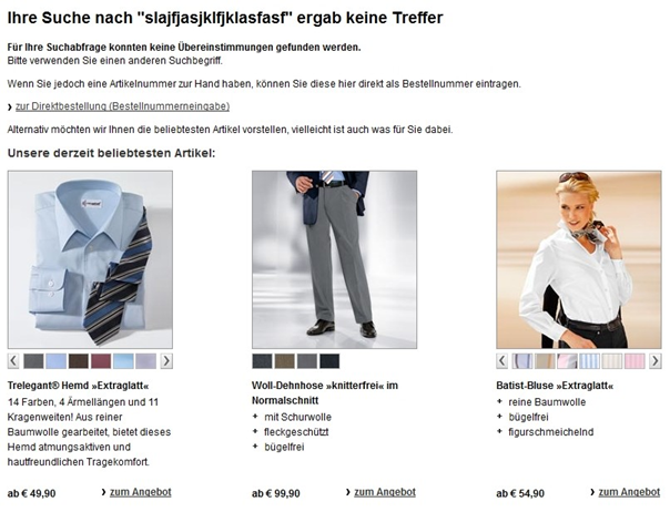
Offer a "not-found" page for zero result searches
In the event that users are unable to find the desired product, they should be presented with a “not-found” page, which also provides further hints or product recommendations. Another option at this point is to display the entire product range, but to indicate that this list does not contain products relating to the search query.
Use FACT-Finder Modules
You can also improve the users’ search experience by integrating other FACT-Finder modules. In particular, the Suggest, TagCloud and Campaign Manager modules offer significant added value to customers.
Function
Adapting the article number search
FACT-Finder can be set up in such a way that if the search term corresponds to one or more formulas, a specific field will be searched exactly. In this way an article number search will return only the exact matching product.
If no product matches the article number entered, FACT-Finder normally searches in an error-tolerant manner. If you do not want to display articles found in this way but would prefer to display the Nothing Found page instead, you must evaluate the search results status accordingly.
Showing information on the “not-found” page
Thanks to its error tolerance and search algorithms, FACT-Finder is frequently able to avoid returning an empty search result to your customers. However, this situation cannot be avoided completely. As a result, you need to consider what you want to show to customers who are unable to find what they seek.
A range of different options is available. In all cases you should display an informative text to the effect that no matching products have been found, and offer the opportunity to repeat the search using different terms.
However, it is also a good idea to use this normally rather empty page to provide the customer with additional data. For example, you could display the most frequently used search terms, or a list of top-selling products, in order to awaken the user’s interest. The FACT-Finder Campaign Manager and FACT-Finder Tag Cloud modules are very useful in this respect.
Only evaluate customer search queries
In order to achieve greater accuracy in your evaluation of customer search patterns, we recommend that you exclude the searches made by you and by your employees from the evaluation. It may also be useful to exclude searches that come in through specific advertising paths.
To do this, pass the log parameter in addition to the search query. The value in this parameter is used to describe the log file entry and can be viewed when analysing the log file. You can use values such as “internal” or “adwords”.
The parameter and its value can be passed just like any URL parameter or CustomParameter.
Allowing users to change view
If your product range is very large, it may be helpful to your visitors to allow them to switch between gallery views and list views of the search results. This function should be easy to access by clicking an appropriate icon.
You can also select the view dynamically, using attributes associated with the hitlist. For example, if the search results mainly comprise items of fashion, you would want to show a gallery view as the default view. On the other hand, if most products are technical items it is better to display a list view.
Failover options
Despite all of the mechanisms and systems you put in place to avoid this happening, sometimes your search facility may not be accessible. In such cases, the user should be presented with an error page that clearly explains the situation in layman’s terms. This will generate greater acceptance than displaying purely technical information.


