ASN Best Practices
The purpose of this section is to provide suggestions and ideas on how to integrate FactFinder. The items below should be viewed as hints and are intended to explain the possibilities for your implementation. Depending on your shop and sector, it may be that some of the items below are not suitable or can be ignored.
ASN Examples
ASN Design
Place ASN to the left of the search results
The ASN should normally be located to the left of the search results. If you display it above the search results you may find that users then do not immediately see any products and have to scroll down.
Use preview images
There is an option to return and display preview images for the individual filter options. These images can provide shop visitors with a quick overview of what the filtered results contain.
Use visual filter elements
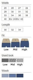
Some attributes are well-suited to this form of visual presentation, which quickly indicates to users what the filter does. For example, you could display a colour filter using different coloured symbols. In addition, users often appreciate the meaning of small icons used in filter elements (such as tailoring cuts).
ASN Functions
Extracting attributes from descriptive texts
If your shop system does not have attributes in a clearly structured form, and product characteristics are somewhat “hidden” in the descriptions, you may find the Attribute generator module helpful. This module extracts the relevant attributes from brief and long descriptions and prepares the product data for browsing using filters.
Simple limitations for numeric groups
There are many approaches when it comes to limiting ranges of numeric filters. For example, you can offer the customer predefined or dynamic price ranges, a slider control and/or input boxes. As a FactFinder customer, however, you have access to the One-Touch Slider, which we developed ourselves. This slider tool allows users to select a desired range of values simply by clicking and moving the mouse.
ASN Usability
Limit options
Customers should be able to limit their search results using a range of attributes. However, the number of attributes available should not detract from the actual search result. Therefore, you should limit the available options. This can either be done by defining dependencies between attribute groups, or by only displaying certain groups if a certain proportion of the search result supports the corresponding attribute filter.
Use sliders and numeric groups
When it comes to numeric groups there are a couple of other peculiarities that are worth considering. For example, the easiest way (for the customer) of limiting a specific range of values is to use a slider control. If you do not want to use this control, then you should present logical ranges that visitors can use to filter the results.
Enable multiple choices
With some attributes you should also permit multiple selection so that the user can find it easier to browse to the desired product.
Highlight frequently used filter options
Frequently used filter options such as category and manufacturer should be easy for visitors to find and to use. On the other hand, attribute filters such as size and storage capacity can be displayed as drop-down boxes.
Sort filter elements by number of hits
The filter elements themselves should be sorted by the number of hits. There are, of course, exceptions to this, so it makes sense to sort manufacturers alphabetically. When it comes to clothes sizes we also recommend that a more logical sort order is used.


